
Branding · Editorial · Ongoing Creative Direction
.png)
The Brief
Sugar and Coffee is a café located in the magical town of Turín, born from a family’s desire to create a refuge for coffee lovers in a place full of charm and community.
The client came to me looking for an “aesthetic café for Instagram.” I delivered something deeper: a brand with soul, warm, authentic, and genuinely connected to people.
I developed the strategy, visual identity, packaging system, printed and digital menus, and to this day, I continue creating the editorial content that has kept the brand alive for over two years.


01 · Foundation
Strategy
before
aesthetics.
Before designing a single mark, we defined the foundation: a purpose to transform the everyday into something extraordinary, a personality built around the idea of a trusted neighbor, and six guiding words: welcoming, modern, warm, relaxed, inspiring, comforting.That would shape every visual decision for years to come.
We mapped the two core audiences: students looking for a place to gather and study, and adults looking to disconnect from work stress. Both share the same need a place that feels like home.
Mision
At Sugar and Coffee, we are dedicated to creating a refuge for lovers of coffee and good food. We want our customers to disconnect from their routine and enjoy special moments with their loved ones.
Our commitment to responsibility, integrity, and passion drives us to offer high-quality products in a welcoming environment that reduces daily stress and improves quality of life.
Vision

We envision a world where every meal or sip of our beverages becomes a moment of joy and relaxation. We aspire to be known as a special corner where life’s simplicity is celebrated and everyday moments become extraordinary. Our goal is to help reduce daily stress and improve the quality of life of those who visit us, all guided by our values of responsibility, commitment, integrity, and passion.
02 · Identity
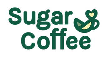
An
ampersand,
not a logo.
The isotype isn't a coffee cup with a heart. It's the visual sum of three ideas: experience, flavor, and happiness, collapsed into the abstract form of an ampersand. The “and” that holds the brand name together becomes the brand itself.
The wordmark uses a rounded, friendly typography that echoes the warmth of the neighborhood the café serves.


Purpose
"We didn't design
a beautiful café.
We designed a café
that feels like
a neighbor."
Charlotte Design Studio · Strategic Direction
03 · Packaging
One coffee
to wake up,
another to shine.
The takeaway packaging is more than a container. It’s the brand walking through town. We wrote a phrase to live on the carrier sleeve, designed for the real people of Turín who carry their morning coffee to work, to school, and to family.
The illustration system uses clouds, stars, and bursts to feel optimistic without becoming childish, a quiet kind of joy.


The fundamental purpose of Sugar and Coffee is to relieve daily stress — recognizing how difficult it can be to find time to relax during the week. To achieve this, we developed a creative communication strategy aimed at connecting with adult consumers and students alike.
It takes shape in a takeaway packaging design that not only goes with you, but also inspires you with the phrase "one coffee to wake up and another to shine."
04 · Digital & Print
A complete
ecosystem.
Every customer touchpoint was designed: the Instagram profile, the printed table menu, and the digital menu on mobile. Each piece follows the same visual logic, with illustrations of a chef and a barista guiding the customer through the experience.
The result is coherence. From the first follow to the first bite, the brand speaks with one voice.


"A well-designed brand
can die in a bad print run.
So we choose the
printers ourselves."
05 · Evolution
The menu
grew.
So did the brand.
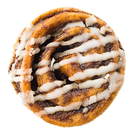
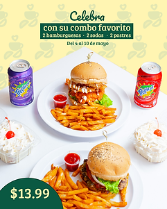
Two years after launch, Sugar and Coffee added burgers to their offering. We updated the menu system, both printed and digital, with new product photography and a refined visual hierarchy that integrates seamlessly with the existing identity.
The brand was built to grow. Each new product line doesn’t require a redesign, only a thoughtful expansion within the system already in place.


06 · Creative Content Direction
Post
Carousel
Campaign
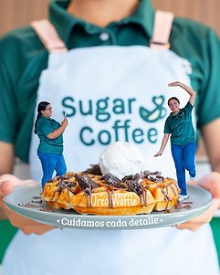
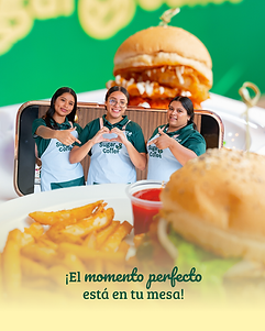
Two years after launch, we still direct the editorial content for Sugar and Coffee: monthly campaigns, seasonal moments, product launches, and creative photoshoots. Every piece is built within the same visual world: same illustrations, same typography, same voice.
We write the copy. We art direct the photography. We design the layout. The brand never breaks character, even when the message changes.


@sugar_andcoffe_sv


06 · Living System
Templates
that keep
the brand alive.
We designed a complete content template system for the brand: Instagram posts, stories, monthly campaigns, and seasonal collages. Each template is built on the brand’s grid, palette, and typographic rules, so the brand stays consistent even as content evolves week to week.
The Instagram account grew from 357 followers at launch to over 2,000, built on consistent editorial direction, never on shortcuts.
Templates
Reference images

